NDVI time-series via Cloud Optimized Geotiffs (COG) - Part 2
The ideas and code examples as discussed here build on Part-1 of this two part post. It is recommended Part 1 is read first.
NDVI At the field level
Where Part 1 calculated the NDVI values for the bounding box area of interest, Part 2 focuses on providing insights at the field level. This is achieved by reading in polygons defining fields via the geopandas python library and extracting the NDVI values as created in Part 1 for each individual field.
Getting started
As to reduce duplication, this post picks up from Part 1 using the same list of images as stored by the variable images in Part 1.
Reading in the fields
For the purpose of this, I defined 6 polygons representing 6 fields I wanted to track the NDVI values across. The field extents are read into at geopandas dataframe for plotting.
import geopandas

fields = geopandas.read_file('~/projects/ndvi_from_cog/canterbury_fields.geojson')
Once read in we can visualise the fields extents.
fig, ax = plt.subplots(1, figsize=(10, 10))

rgb_axes = show(images[0]['rgb'],
                transform=images[0]['transform_window'],
                ax=ax,
                alpha=.75,
                cmap="RdYlGn",
                title="Tracked Fields")
fields.boundary.plot(ax=ax, color='skyblue', linewidth=4)
rgb_axes.ticklabel_format(style ='plain') # show full y-coords

Masking NDVI by field
By adding a function using numpy array masking, we can create individual field representations of the NDVI values by masking all NDVI array values that fall outside of each field.
import numpy.ma as ma
from rasterio import features


def mask_ndvi_by_field(ndvi_image, field_geom):
    """
    returns a numpy mask
    """
    mask = features.geometry_mask(field_geom,
                                out_shape=( ndvi_image.shape[0],  ndvi_image.shape[1]),
                                transform=image['transform_window'],
                                all_touched=False,
                                invert=False)
    ndvi_masked = ma.masked_array(image['ndvi'], mask)
    return ndvi_masked
Using the above function, we iterate over all the NDVI images associated with each date and stored the NDVI values within each field against the field_id
for image in images:
    ndvi_fields = {}

    for index, row in fields.iterrows():
        field_mask = mask_ndvi_by_field(image['ndvi'],row.geometry)
        ndvi_fields[row.field_id] = field_mask
        image['ndvi_fields'] = ndvi_fields
We can then select one of the NDVI records and visualise just the fields of interest with the associated RGB image for context
fig, ax = plt.subplots(figsize=(10, 10))
show(images[0]['rgb'], transform=image['transform_window'], ax=ax, alpha=.50)

for field_id, field_ndvi in images[0]['ndvi_fields'].items():
    rgb_axes= show(field_ndvi, transform=image['transform_window'],
         ax=ax,
         cmap="RdYlGn",
         vmin=-1,
         vmax=1,
         title=f"NDVI Masked by Fields of Interest ({images[0]['date']})")

rgb_axes.ticklabel_format(style ='plain') # show full y-coords
Via matplotlibs gridspec we can also grid all occurrences of the imagery and NDVI values that met our satsearch (see Part 1 for filtering via satsearch) query. This provides an interesting insight into the changing NDVI values and thus agricultural practices over time.
from matplotlib import gridspec
import matplotlib as mpl

# compute the number of rows and columns
n_plots = len(images)
n_cols = int(np.sqrt(n_plots))
n_rows = int(np.ceil(n_plots / n_cols))


# setup the plot
scale = max(n_cols, n_rows)
fig = plt.figure(figsize=(5 * scale, 5 * scale))
grid = gridspec.GridSpec(n_rows, n_cols, fig, wspace=0.4)


# iterate through each subplot and plot each set of data
for i in range(n_plots):
    ax = fig.add_subplot(grid[i])
    axes_subplot = show(images[i]['rgb'],
                        transform=transform_window,
                        ax=ax,
                        alpha=.65,
                        title = images[i]['date'] )

    # plot the field data
    for field_id, field_ndvi in images[i]['ndvi_fields'].items():
        im = show(field_ndvi, transform=transform_window,
             ax=ax,
             cmap="RdYlGn",
             vmin=-1,
             vmax=1,
             )
    axes_subplot.ticklabel_format(style ='plain') # show full y-coords


# Add custom color bar
mpl.cm.cool
norm = mpl.colors.Normalize(vmin=-1, vmax=1)

fig.colorbar(mpl.cm.ScalarMappable(norm=norm, cmap="RdYlGn"),
             ax=grid.figure.get_axes() , orientation='vertical', label='NDVI')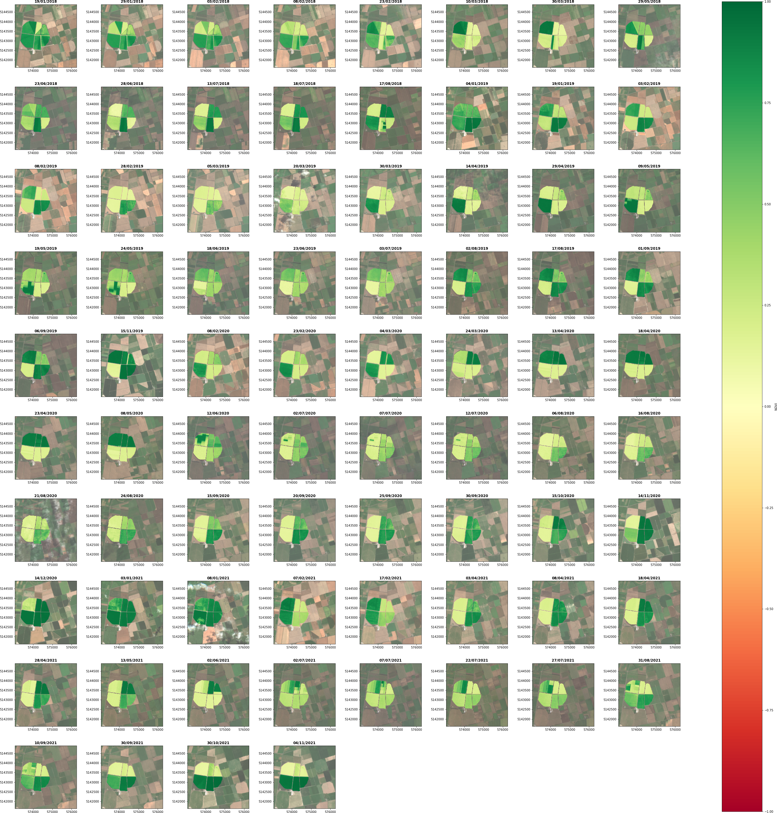
Graphing NDVI overtime
Visualising NDVI over time via a map plot provides interesting insights. However, graphing these values over time may provide more insight.
For the purpose of this we are going to track just one of our fields. Field 6. Below we highlight this field.
# Use geopandas `loc` to select the field where field_id == 6
field_6 = fields.loc[fields['field_id'] == '6']

fig, ax = plt.subplots(1, figsize=(12,12))

rgb_axes = show(images[0]['rgb'],
                transform=image['transform_window'],
                ax=ax,
                alpha=.75,
                cmap="RdYlGn",
                title="Field 6")
fields.boundary.plot(ax=ax, color='skyblue', linewidth=4)
field_6.boundary.plot(ax=ax, color='yellow', linewidth=6)
rgb_axes.ticklabel_format(style ='plain') # show full y-coords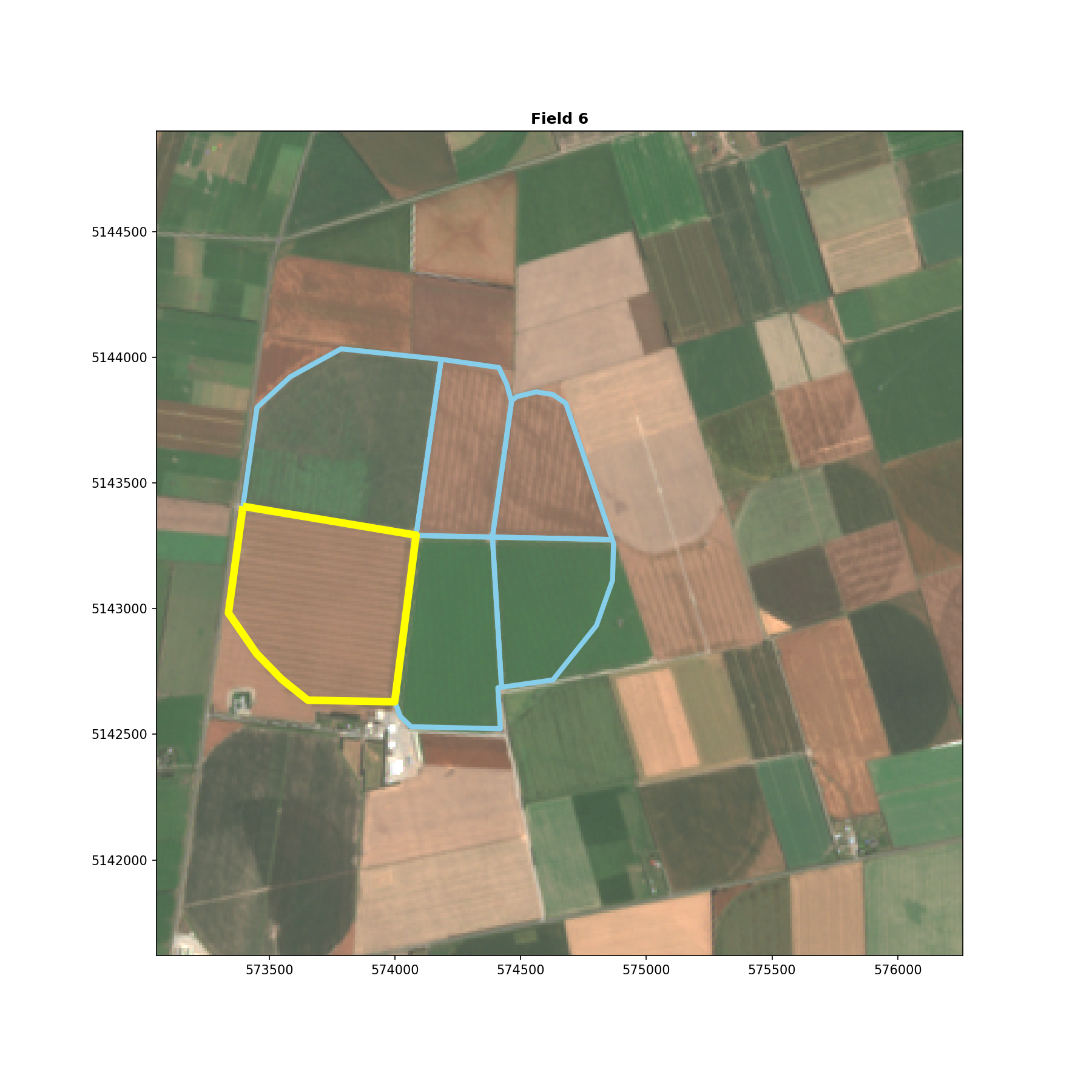
Using matplotlib and numpy calculate the mean NDVI value for field 6 for each image date and plot.
dates = np.array([images[i]['date'] for i in range(len(images))])
ndvi_values = np.array([images[i]['ndvi_fields']["6"].mean() for i in range(len(images))])


fig, ax = plt.subplots(figsize=(20, 8))

ax.plot_date(dates, ndvi_values, marker='', linestyle='-')
fig.autofmt_xdate()
fig.suptitle('Mean NDVI for Field 6 (2018-2021)', fontsize=24)
plt.xlabel('Date', fontsize=18)
plt.ylabel('Mean NDVI', fontsize=18)

plt.show()
Having plotted the average NDVI for Field 6 it is much clearer when agricultural practices are occurring and at what frequency. For example, harvests are evident via the sharp drop offs in NDVI values.

Summary
Interesting insights into agricultural practices can be achieved by mapping NDVI over time. In this case the agricultural environment is highly controlled and it would be interesting to map seasonal changes in more natural environments that would show stronger seasonal patterns.
While this process has been developed for calculating NDVI, other remote sensing indices such as those for indicating water and snow could be applied with very little effort.